Press play to scroll through the interactive presentation.
Make it make sense.
I’m always looking for opportunities to innovate.
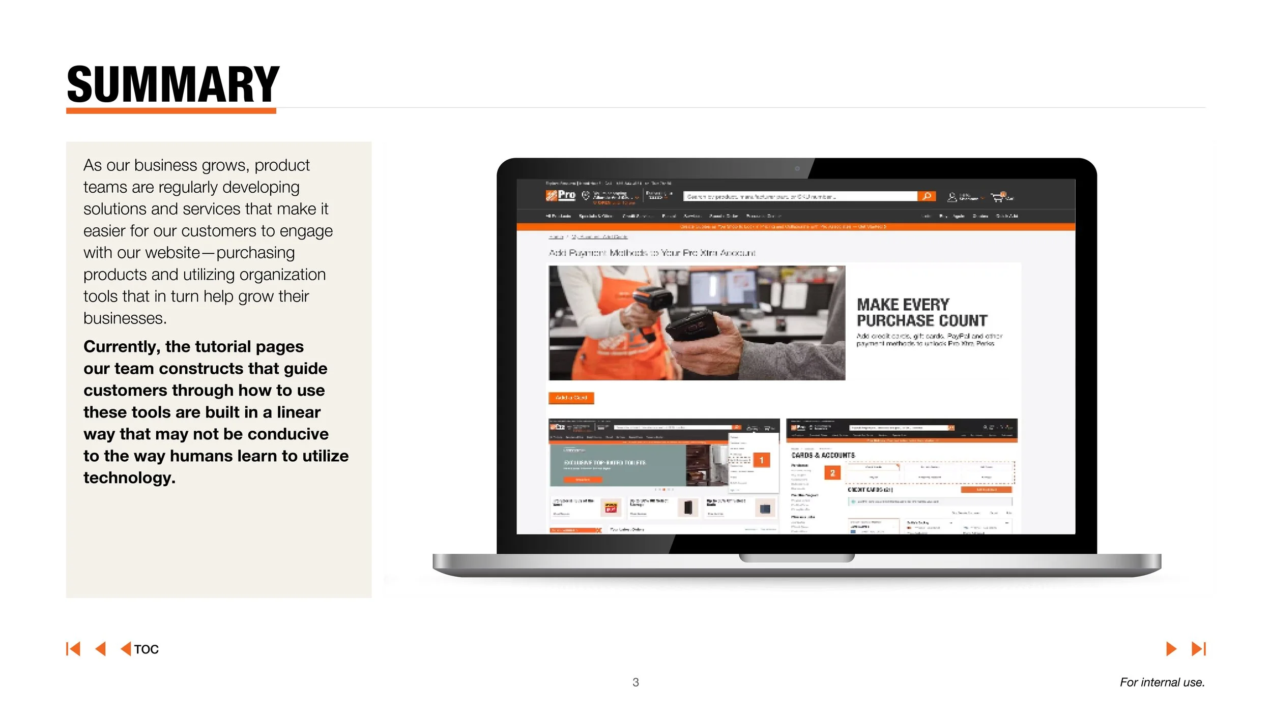
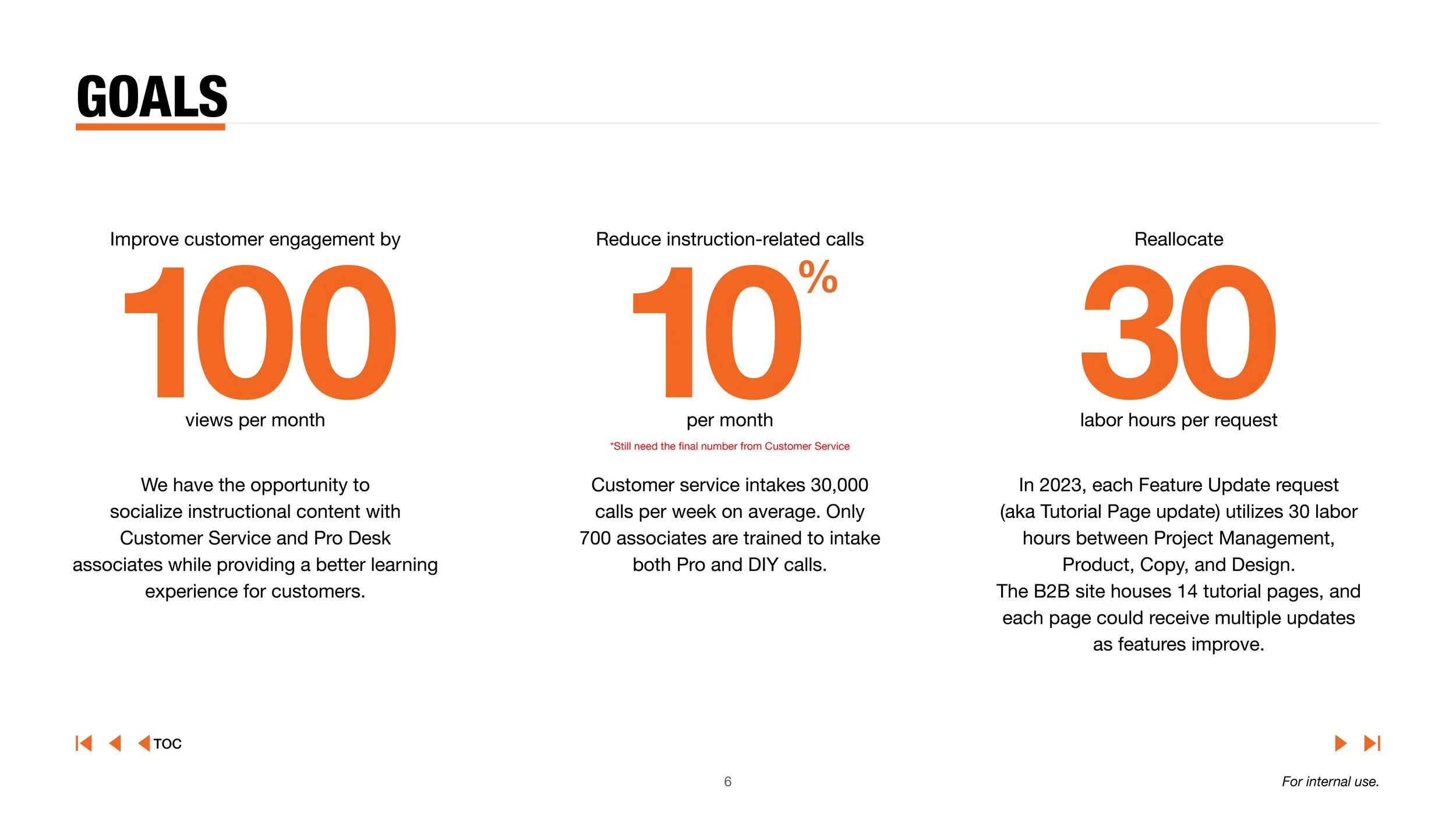
Early on, I noticed our instructional pages were static, text-heavy screenshots that offered little engagement and drove almost no traffic.
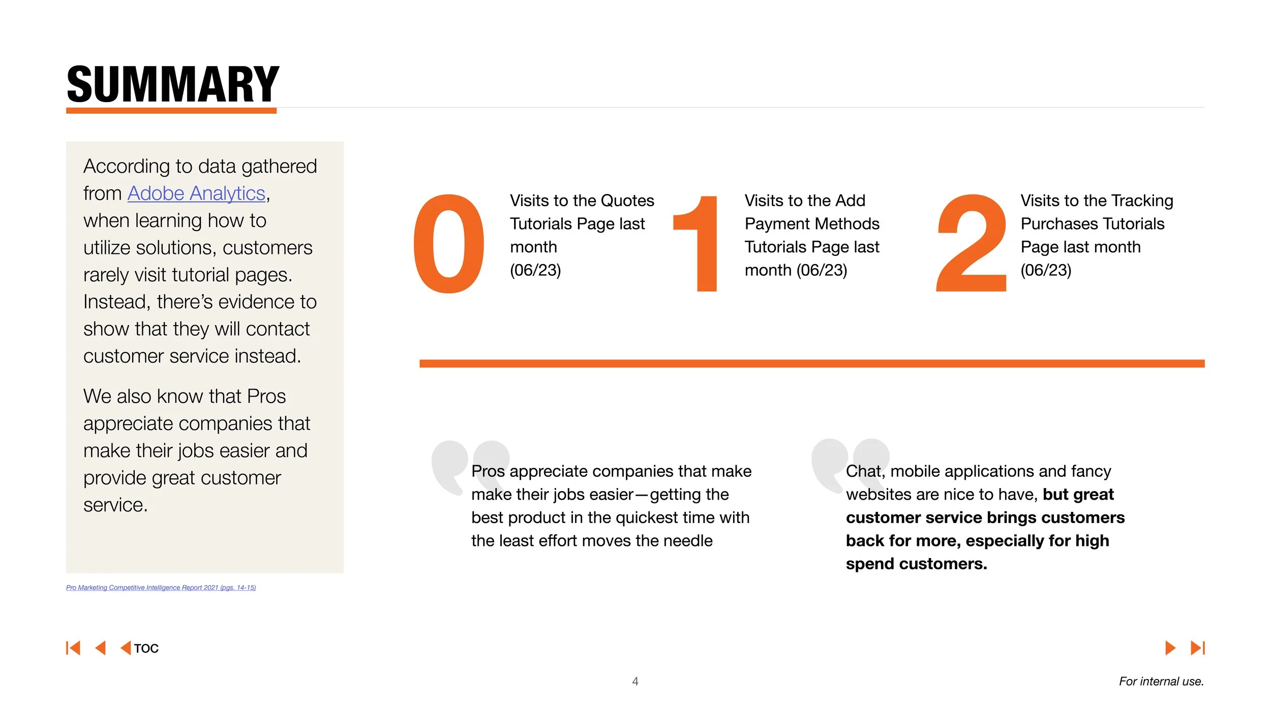
Interviews with customer service teams revealed that customers were calling for help instead of self-serving online, creating friction for both users and internal teams.
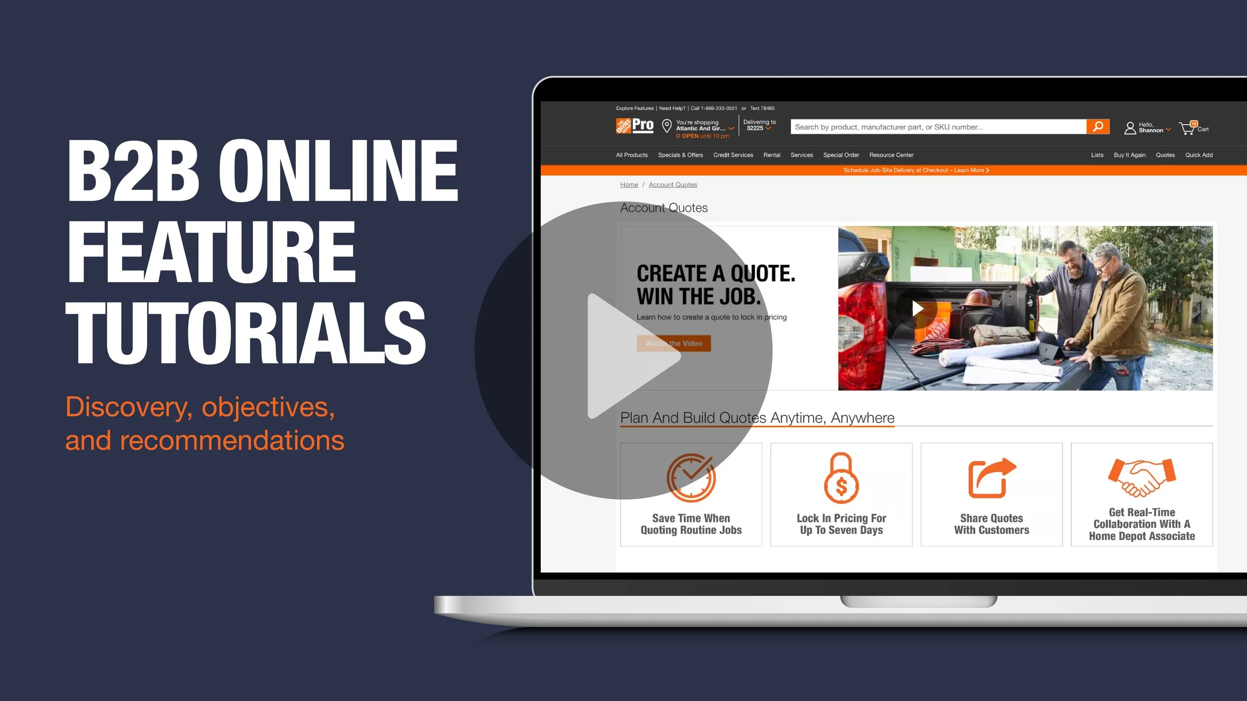
I saw an opportunity to rethink how we presented instructional content, especially for our Pro audience, whose tool usage directly impacts spend.
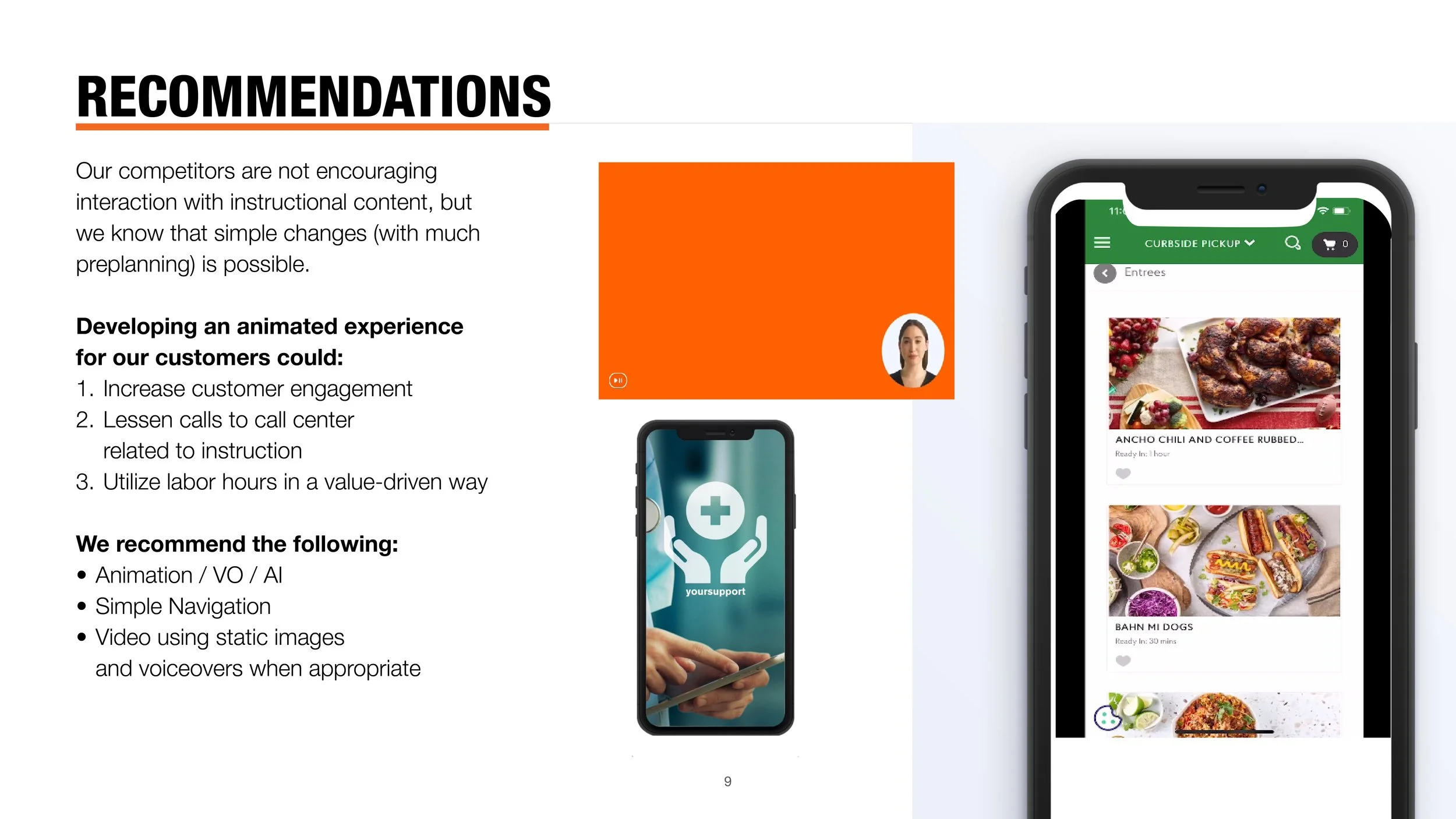
I used internal data and external research to hypothesize that motion and clearer visual hierarchy could drive engagement.
Using the Quotes page as a pilot, we saw page visits rise 14% and interactions with the tool increase nearly 500%, proving that thoughtful design can drive both experience and business results.